Every aspect of A Hat in Time is meticulously designed and pitch perfect. The aesthetic side of things are incredibly strong; the game is filled with beautifully-animated, cel-shaded style worlds, each with it’s own hilariously-written and quirky side characters. The entire thing is scored with a triumphant and exciting soundtrack that makes you feel ready to set out on an adventure. Protagonist Hat Girl is given a strong personality with almost no dialogue, and is one of my favorite new main characters in the past decade or so. The controls are tight and so much fun to use, which is critical to a platformer that relies on navigating spaces. Few games make simply moving around a level feel so natural and easy.
And while that all is nice, there’s one specific aspect of the design that I’d like to focus on: the construction of the worlds that serve as your digital playgrounds. A Hat in Time makes some interesting choices in how they went about building these stages that I feel like digging into a little, because I think the variety they provide are part of what keeps the game feel so exciting and new at every turn.
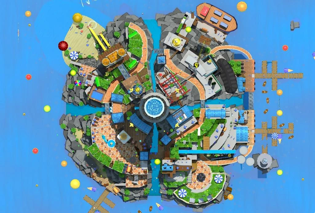
Each of the game’s four worlds (which the game refers to as “chapters”, with the missions subdividing them as “acts”) is built upon a different school of thought of platformer level design. The first chapter, Mafia Town, fittingly takes probably the most well-known basic style, something between a hub-and-spokes and tiered-level design (maybe something like “wedding cake” could give you a good mental image). Essentially, the level is designed radiating out from a central point to keep it easy for the player to picture and navigate while also feeling less linear and more open world. Additionally, that central point is raised to give players a high point to visually survey the full area if needed, with a number of paths to this point that offer variety to traverse the map while still acting as something like access points (the “spokes” of the Hub-and-Spokes). Super Mario 64 has probably the most notable style of this design (about half of their stages fit this example), with stages like Bob-omb Battlefield, Whomp Fortress, Cool, Cool Mountain, and several others severing as examples.
Mafia Town would feel right at home with these stages, as a town built around a mountainous island, divided into concentric rings connected through various slopes, slides, and staircases. A top-down view of the level makes this pretty apparent. As probably the most iconic and familiar style of level in 3-D platformers, it makes sense that this would serve as the first level, although there are some significant differences with the old style.
Notably, Gears for Breakfast rotates the starting point around the map to follow the narrative flow of the story and reduce redundant backtracking across the map at the start of each mission. Also, unlike Mario 64 and more in-line with later examples of the genre, it makes sure actually provide more of a reason to kick you back to the hub world after collecting the MacGuffin at the end of each level, with different acts frequently featuring changes to the world and making it feel much less like you could have picked up multiple Time Pieces in a single run if you hadn’t been sent away.
Speaking of changing the map, the second chapter, Battle of the Birds, takes this to an even greater extreme. The world is essentially three different maps that are connected narratively but completely separate physically; the space you explore in acts two and four (a train) have nothing in common with the one in acts three and five (a town square), and the level you play through in the first act (the movie studio) won’t be seen again at all until the resolution in act six.
However, all three of these places share a similarity in their design, in that they’re Linear. There will be branches and side rooms to explore, but you more or less have to follow the path laid out, which makes a lot of sense given that this is the most narrative-heavy chapter, and it’s a lot harder to lay out an ordered narrative if the player is given too much freedom in the order they can tackle objectives.
Instead of exploration, the game creates the challenge in making you figure out how to get from one point to the next, much like a 2-D platformers or the Sonic Adventure series (or, if you want to stick to the Mario series example, the Bowser levels in Mario 64). The spaces and missions chosen even physically reflect this linear mentality, with one of the worlds being a train (meaning that most of your navigation will be forward a car or back a car), and one of the two missions in the most open world (the town square) being to lead a parade along its route line.
Then, there’s the third world, Subcon Forest. It’s a fairly standard Sandbox level, focused mostly on exploration, similar more to the levels of games like Banjo-Kazooie or Super Mario Sunshine. There are walls that keep you from wandering into certain areas at the start, but you can permanently remove those in basically any mission at your leisure. Of course, playing into the wide-open nature of the world, some of those locked-off areas are even totally optional, guiding you to explore to finish off all of the side quests while also not forcing you to do so to progress the story.
Drawing a line between this style and the Tiered Hub-and-Spokes design of the first chapter can be tough, but there are a few crucial differences in my mind. The Hub-and-Spokes designs usually focus on building vertically, cramming more things into less square footage and frequently making the entire level visible from the peak. The Sandboxes, meanwhile, don’t care as much about sprawl, instead making traversing large areas part of the experience. Notably, A Hat in Time plays into this feeling by making its Sandbox level a seemingly-endless haunted forest.
Another notable feature of the Sandbox as compared to Hub-and-Spokes is freedom of movement. Getting from Point A to Point B in the latter is usually restricted in some way, by things like paths up mountains or alleyways through restrictive areas. And because of added vertical traversal, there are usually multiple fairly-equivalent paths to go between the points. The Sandbox, meanwhile, will have no restrictions, and a simple straight line going from Point A to Point B is usually the best options.
Also, it’s worth noting that Sandboxes aren’t necessarily without large central structures; Subcon Forest itself has a large tree at the center with items at the peak for people who can climb it. But reaching the apex doesn’t really change getting from one point to another; it doesn’t provide a shortcut or impede movement elsewhere. It's just another challenge of the stage.
The last world, Alpine Skyline, is a sort of variation on the Linear structure of the second chapter. However, it seems to borrow from Super Mario Galaxy, focusing on smaller sections of platforming, occasionally with branches in the path, and each separated from each other. Whereas Super Mario Galaxy pulled this off with planets and cannons shooting you between them across space, Alpine Skyline instead finds Hat Girl ziplining between distinct mountain peaks. The branching paths keep some level of exploration, the small chunks the level is broken up into allow for some variety and creativity in the level design, and the challenge of the world makes up some for the less-prominent narrative of the world. It also dips its toe slightly into the Hub-and-Spokes design, with a central town and individual routes branching out from it, which can be tackled in any order.
This exercise is mostly observational, and not meant to be definitive; nothing says these are the only styles of 3-D platforming worlds available. Additionally, worlds can and frequently do mix-and-match in their design, even sometimes just by making single levels within that follow specific styles of gameplay. A Hat in Time specifically serves as a strong cases study in the process of game-world design; each world has a clear intentionality in how it was built up and how a player is expected to traverse it, the game makes use of its short length to showcase as many styles as possible, and the attention to detail and level of effort put in the game make every level an especially fun example to test out and see for yourself.
No comments:
Post a Comment